Measures of globalization
Don Share, one of Patrick O'Neil's colleagues at the University of Puget Sound, forwarded this graphic from Swiss Federal Institute of Technology.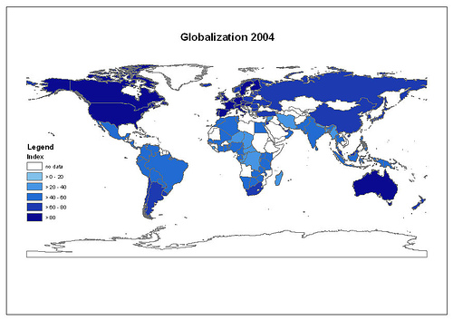
O'Neil wrote, "The institute has an interesting site with maps and lists that rank of different levels and forms of globalization (economic, social, political) over the past thirty years (there's even an animated map showing these changes over time)."
Check out their material at the site of Der Eidgenössische Technische Hochschule Zürich (The Swiss Federal Institute of Technology Zurich).
This is great stuff. Once again, thanks to Dr. O'Neil.
You and your students will find a raft of longitudinal data that could be used to understand the effects of globalization. For example, as you look at the animated map, you'll notice that the status of countries changes from year to year. You could ask your students to identify the events that caused changes for Russia, China, Nigeria, Mexico, and Iran. Then you could ask them to evaluate the validity of those changes. (Don't expect to see much change for the UK.)
posted by Ken Wedding @ 2:39 PM
![]()
![]()


0 Comments:
Post a Comment
<< Home